
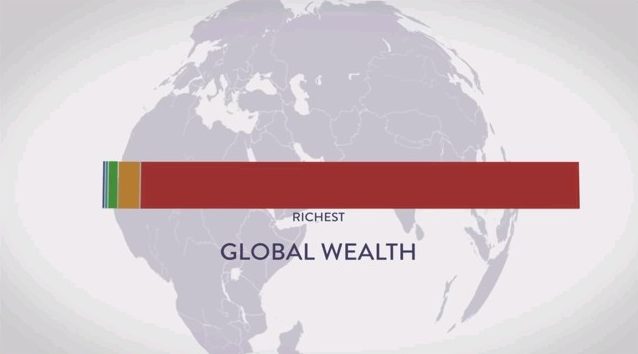
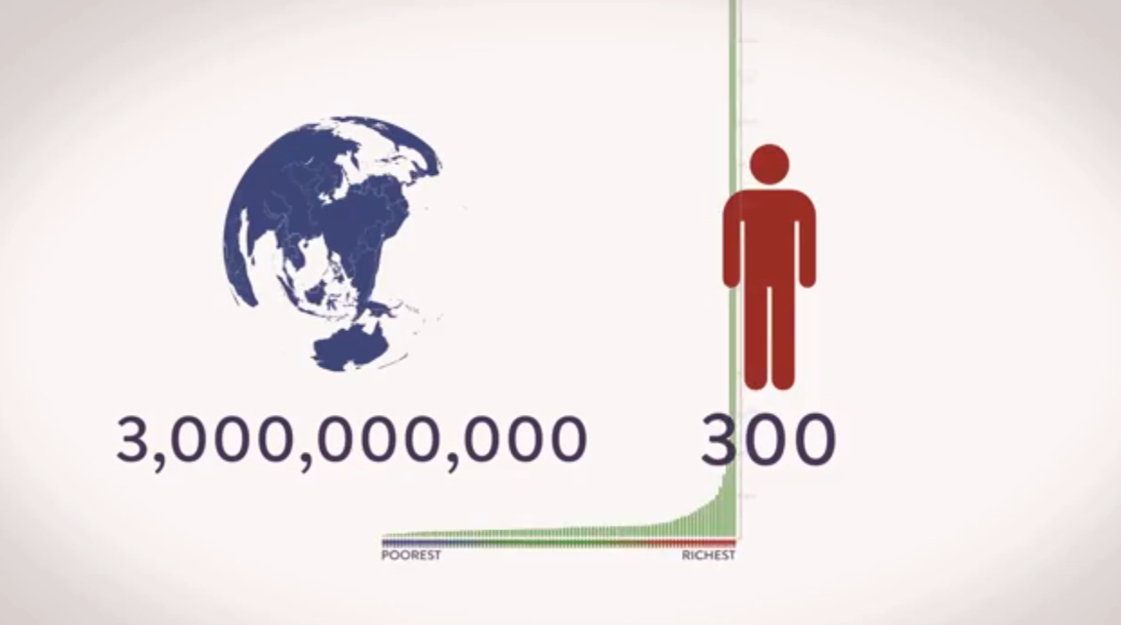
It’s familiar news by now. According to Oxfam, the richest 1% now have more wealth than the rest of the world’s population combined. Global inequality is worse than at any time since the 19th century.
For most people, this is all they know about global inequality. But Oxfam’s wealth figures don’t quite tell the whole story. What about income inequality? And – more importantly – what about inequalities between countries? If we expand our view beyond the usual metrics, we can learn a lot more about how unequal our world has become.
The first key point is that Oxfam’s numbers present a very conservative picture. Given that the rich hide so much of their wealth in tax havens and secrecy jurisdictions – as the Panama Papers have reconfirmed – it is impossible to know how much they really have. Recent estimates suggest that up to $32tn is stored away in tax havens – around one sixth of the world’s total private wealth. If we were to add that to Oxfam’s estimate of how much the rich have, global inequality would look much, much worse.
But that’s wealth. Many analysts object that we shouldn’t be measuring wealth inequality, but rather income inequality. This has been a major criticism of Oxfam’s numbers. And when you look at income inequality, things don’t seem quite so bad. At least not according to the dominant narrative. Branko Milanovic, one of the world’s leading experts on the subject, argues that while inequality is getting worse within countries, on a global scale it is actually getting better.
We normally measure income inequality with the Gini index. A score of 0 represents total equality and a score of 1 represents total inequality, where one person has everything and everyone else has nothing. According to Milanovic, the global Gini index has decreased slightly, from 0.72 in 1988 to 0.71 in 2008. This fact has often been used to calm us down. Don’t worry, it assures us: things are gradually getting better.
But the Gini index is a misleading measure. It only captures relative changes, so if the incomes of the rich and the poor increase by the same rate, then the Gini index remains the same, even though absolute inequality is increasing. In other words, if a poor person earns $10,000 and a rich person earns $100,000, and then both of them double their incomes, the Gini index remains the same, even though the income gap will have grown from $90,000 to $180,000.
Economist Robert Wade argues that the Gini index is a highly conservative measurement, as it obscures the true extent of inequality. We should be using the absolute Gini index, he says. So what happens if we do that? We see that inequality has exploded over the past few decades, from 0.57 in 1988 to 0.72 in 2005.
But hold on, you might say. Income inequality among individuals might be getting worse, but surely the gap between poor countries and rich countries is narrowing. This is a common opinion; I hear it all the time from students at the London School of Economics, where I teach. After all, “convergence theory” holds that, because poor countries grow at a faster rate than rich countries, over time the gap between the two will automatically diminish.
Unfortunately, it’s not true. In fact, history shows exactly the opposite. Inequality between countries has been increasing by orders of magnitude over the past two hundred years, and shows no signs of slowing.
There are a few ways we can look at this. Probably the most common way to think about global inequality is to measure the gap between the richest and poorest countries in real income per capita. Using data from the Maddison Project, we see that in 1960, at the end of colonialism, people living in the world’s richest country were 33 times richer than people living in the poorest country. That’s quite a substantial gap. But then by 2000, after neoliberal globalisation had run its course, they were a shocking 134 times richer. And that’s not counting extreme outliers, like small oil-rich kingdoms in the Middle East or tiny offshore tax havens. This isn’t convergence. To quote Lant Pritchett, it’s divergence, big time.
Of course, this metric may overstate inequality by focusing on countries at either extreme. We can correct for this by looking at regional differences. The best way to do this is to measure the gap, in real terms, between the GDP per capita of the world’s dominant power (the United States) and that of various regions of the global South. Using World Bank figures, we see that since 1960 the gap for Latin America has grown by 206%, the gap for sub-Saharan Africa has grown by 207%, and the gap for South Asia has grown by 196%.
In other words, the global inequality gap has roughly tripled in size.
Over the past few decades inequality has become so bad that, in 2000, Americans were nine times richer than Latin Americans, 72 times richer than sub-Saharan Africans, and a mind-popping 80 times richer than south Asians. These numbers give us a sense for how unfairly the global economy distributes our planet’s wealth.
It doesn’t matter how you slice it; global inequality is getting worse. Much worse. Convergence theory turned out to be wildly incorrect. Inequality doesn’t disappear automatically; it all depends on the balance of political power in the global economy. As long as a few rich countries have the power to set the rules to their own advantage, inequality will continue to worsen. The debt system, structural adjustment, free trade agreements, tax evasion, and power asymmetries in the World Bank, the IMF, and the WTO are all major reasons that inequality is getting worse instead of better.
It’s time we face up to the imbalances that distort our global economy. There’s nothing natural about extreme inequality. It is man-made. It has to do with power. And we need to have the courage to say so.





Liked your article. Lots of new things to learn about. Can you recommend any books on the subjects of wealth inequality, income inequality, neo-liberalism or the 2008 economic collapse? These are subjects I’m interested in learning about. Thanks 🙂